

cont01
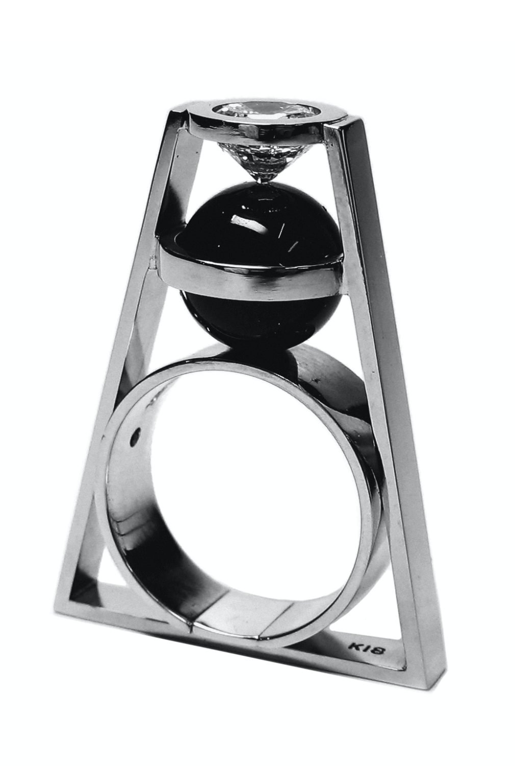
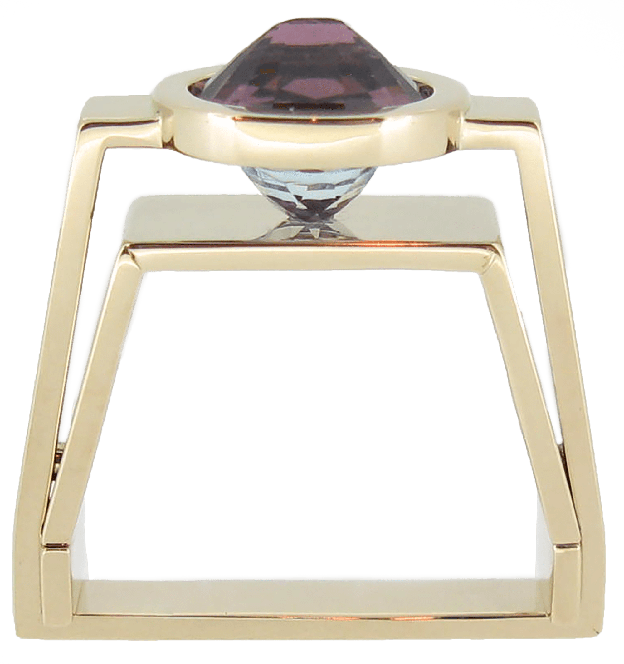
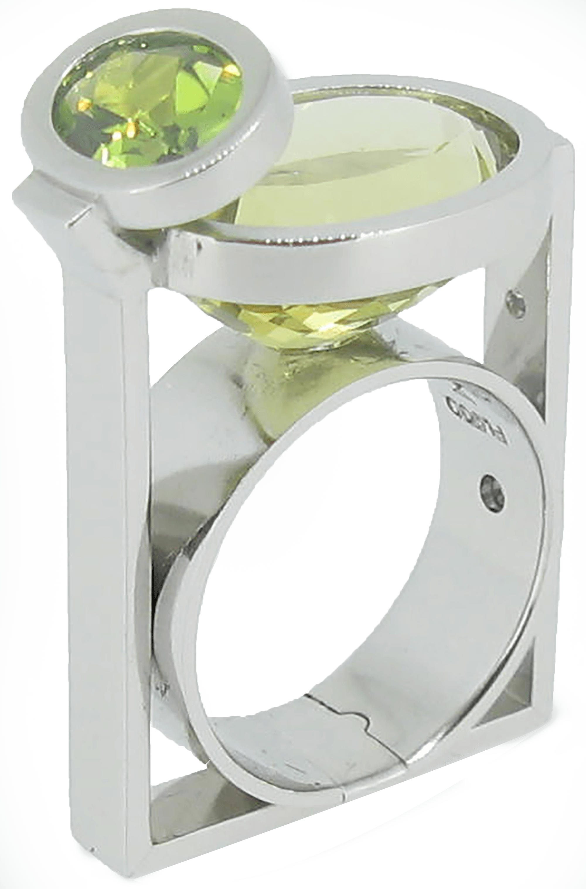
Artworks
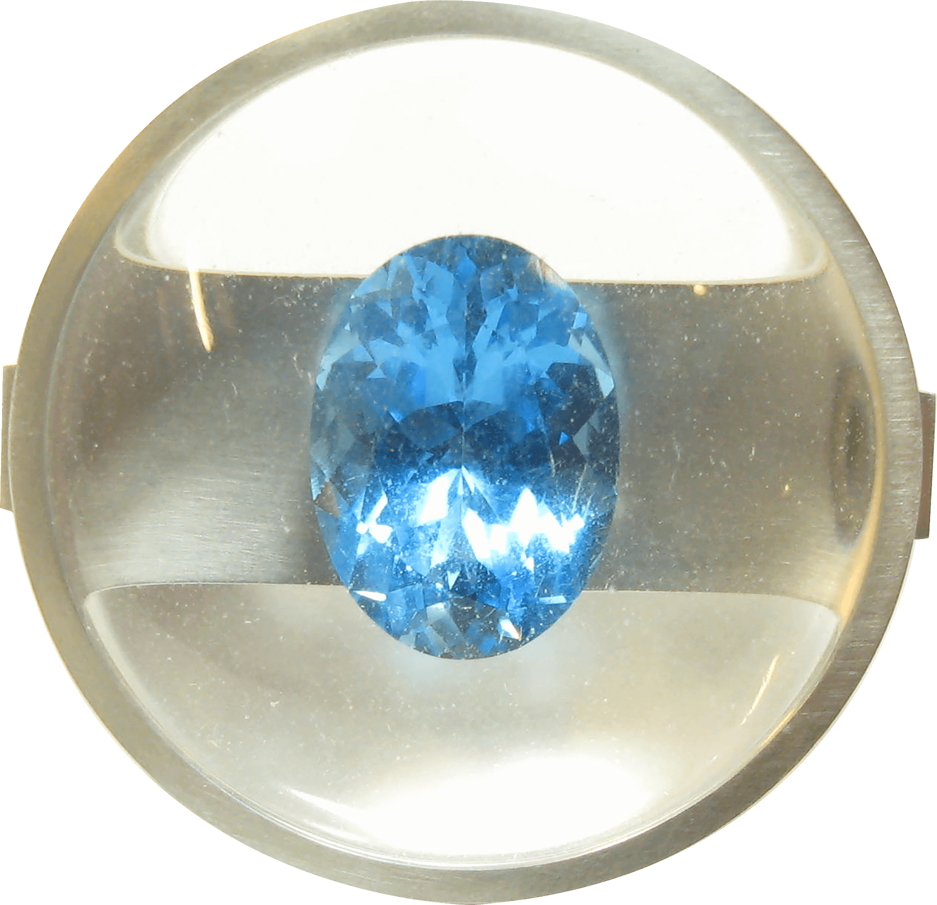
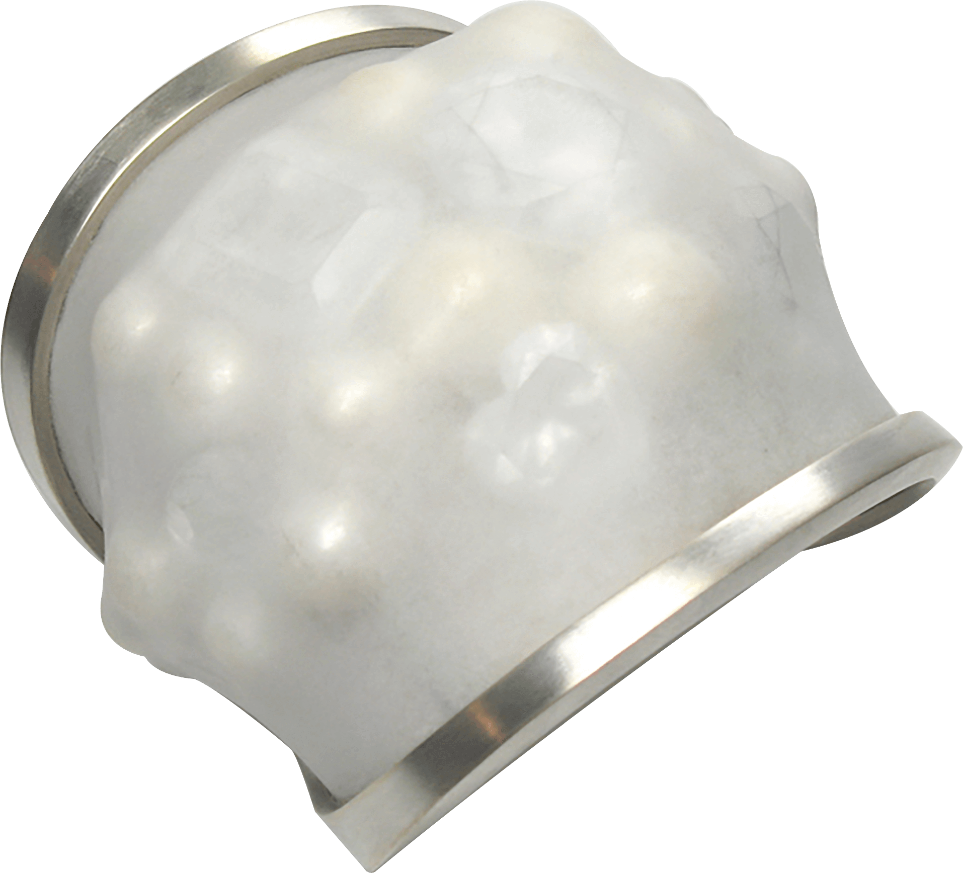
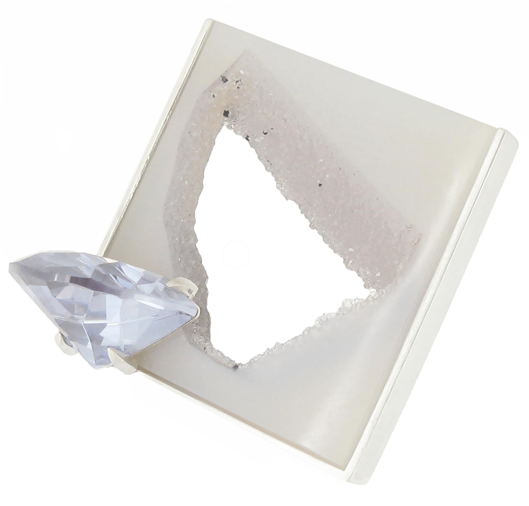
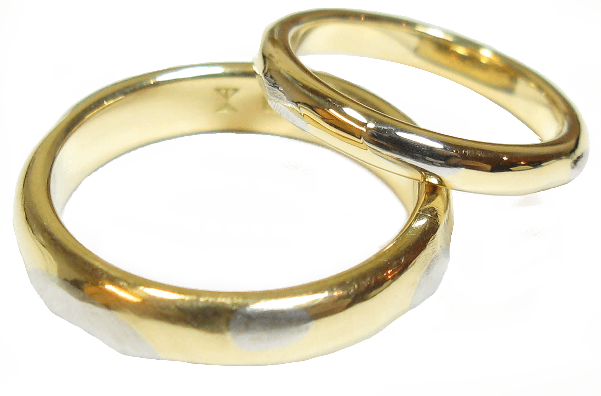
- Material
- silver, cubic zirconia, blue glass, synthetic ruby, synthetic pink sapphire
- 素材
- シルバー/キュービックジルコニア/ブルーガラス/合成ルビー/合成ピンクサファイア
ホフマンはバーゼル造形学校(de:Schule für Gestaltung Basel)の設立に尽力し、また作品のスタイルは国際タイポグラフィー様式(スイス・スタイル)として知られる。彼は、自身が「色の平均化(trivialization of colour)」と呼んだスタイルに対抗して、無駄のない色とフォント使いを強調したポスターデザインで有名である。彼のポスターは、ニューヨーク近代美術館などの主立ったギャラリーで芸術作品として広く展示された。
彼は影響力のある教育者でもあった。1965年には「Graphic Design Manual」を出版し、業界内で教科書として人気を集めた。
Graphic designer and teacher Armin Hofmann does not fit easily into any category – and certainly not the Swiss Style drawer in which he is often wrongly placed. ‘I was never impressed by the Concrete movement’, he said ten years ago at an exhibition of his poster works held at the Museum für Gestaltung Zürich. Interestingly, however, his visual vocabulary does indeed have features in common with the Concrete style developed in the 1950s by Max Bill, Richard Paul Lohse and Josef Müller-Brockmann. For example, he evinces a preference for sans-serif fonts, grid-based design
cont02
Artworks
- Material
- silver, cubic zirconia, blue glass, synthetic ruby, synthetic pink sapphire
- 素材
- シルバー/キュービックジルコニア/ブルーガラス/合成ルビー/合成ピンクサファイア
ホフマンはバーゼル造形学校(de:Schule für Gestaltung Basel)の設立に尽力し、また作品のスタイルは国際タイポグラフィー様式(スイス・スタイル)として知られる。彼は、自身が「色の平均化(trivialization of colour)」と呼んだスタイルに対抗して、無駄のない色とフォント使いを強調したポスターデザインで有名である。彼のポスターは、ニューヨーク近代美術館などの主立ったギャラリーで芸術作品として広く展示された。
彼は影響力のある教育者でもあった。1965年には「Graphic Design Manual」を出版し、業界内で教科書として人気を集めた。
Graphic designer and teacher Armin Hofmann does not fit easily into any category – and certainly not the Swiss Style drawer in which he is often wrongly placed. ‘I was never impressed by the Concrete movement’, he said ten years ago at an exhibition of his poster works held at the Museum für Gestaltung Zürich. Interestingly, however, his visual vocabulary does indeed have features in common with the Concrete style developed in the 1950s by Max Bill, Richard Paul Lohse and Josef Müller-Brockmann. For example, he evinces a preference for sans-serif fonts, grid-based design
cont03
Artworks
- Material
- silver, cubic zirconia, blue glass, synthetic ruby, synthetic pink sapphire
- 素材
- シルバー/キュービックジルコニア/ブルーガラス/合成ルビー/合成ピンクサファイア
ホフマンはバーゼル造形学校(de:Schule für Gestaltung Basel)の設立に尽力し、また作品のスタイルは国際タイポグラフィー様式(スイス・スタイル)として知られる。彼は、自身が「色の平均化(trivialization of colour)」と呼んだスタイルに対抗して、無駄のない色とフォント使いを強調したポスターデザインで有名である。彼のポスターは、ニューヨーク近代美術館などの主立ったギャラリーで芸術作品として広く展示された。
彼は影響力のある教育者でもあった。1965年には「Graphic Design Manual」を出版し、業界内で教科書として人気を集めた。
Graphic designer and teacher Armin Hofmann does not fit easily into any category – and certainly not the Swiss Style drawer in which he is often wrongly placed. ‘I was never impressed by the Concrete movement’, he said ten years ago at an exhibition of his poster works held at the Museum für Gestaltung Zürich. Interestingly, however, his visual vocabulary does indeed have features in common with the Concrete style developed in the 1950s by Max Bill, Richard Paul Lohse and Josef Müller-Brockmann. For example, he evinces a preference for sans-serif fonts, grid-based design
cont04
Artworks
- Material
- silver, cubic zirconia, blue glass, synthetic ruby, synthetic pink sapphire
- 素材
- シルバー/キュービックジルコニア/ブルーガラス/合成ルビー/合成ピンクサファイア
ホフマンはバーゼル造形学校(de:Schule für Gestaltung Basel)の設立に尽力し、また作品のスタイルは国際タイポグラフィー様式(スイス・スタイル)として知られる。彼は、自身が「色の平均化(trivialization of colour)」と呼んだスタイルに対抗して、無駄のない色とフォント使いを強調したポスターデザインで有名である。彼のポスターは、ニューヨーク近代美術館などの主立ったギャラリーで芸術作品として広く展示された。
彼は影響力のある教育者でもあった。1965年には「Graphic Design Manual」を出版し、業界内で教科書として人気を集めた。
Graphic designer and teacher Armin Hofmann does not fit easily into any category – and certainly not the Swiss Style drawer in which he is often wrongly placed. ‘I was never impressed by the Concrete movement’, he said ten years ago at an exhibition of his poster works held at the Museum für Gestaltung Zürich. Interestingly, however, his visual vocabulary does indeed have features in common with the Concrete style developed in the 1950s by Max Bill, Richard Paul Lohse and Josef Müller-Brockmann. For example, he evinces a preference for sans-serif fonts, grid-based design
cont05
Artworks
- Material
- silver, cubic zirconia, blue glass, synthetic ruby, synthetic pink sapphire
- 素材
- シルバー/キュービックジルコニア/ブルーガラス/合成ルビー/合成ピンクサファイア
ホフマンはバーゼル造形学校(de:Schule für Gestaltung Basel)の設立に尽力し、また作品のスタイルは国際タイポグラフィー様式(スイス・スタイル)として知られる。彼は、自身が「色の平均化(trivialization of colour)」と呼んだスタイルに対抗して、無駄のない色とフォント使いを強調したポスターデザインで有名である。彼のポスターは、ニューヨーク近代美術館などの主立ったギャラリーで芸術作品として広く展示された。
彼は影響力のある教育者でもあった。1965年には「Graphic Design Manual」を出版し、業界内で教科書として人気を集めた。
Graphic designer and teacher Armin Hofmann does not fit easily into any category – and certainly not the Swiss Style drawer in which he is often wrongly placed. ‘I was never impressed by the Concrete movement’, he said ten years ago at an exhibition of his poster works held at the Museum für Gestaltung Zürich. Interestingly, however, his visual vocabulary does indeed have features in common with the Concrete style developed in the 1950s by Max Bill, Richard Paul Lohse and Josef Müller-Brockmann. For example, he evinces a preference for sans-serif fonts, grid-based design
cont06
Artworks
- Material
- silver, cubic zirconia, blue glass, synthetic ruby, synthetic pink sapphire
- 素材
- シルバー/キュービックジルコニア/ブルーガラス/合成ルビー/合成ピンクサファイア
ホフマンはバーゼル造形学校(de:Schule für Gestaltung Basel)の設立に尽力し、また作品のスタイルは国際タイポグラフィー様式(スイス・スタイル)として知られる。彼は、自身が「色の平均化(trivialization of colour)」と呼んだスタイルに対抗して、無駄のない色とフォント使いを強調したポスターデザインで有名である。彼のポスターは、ニューヨーク近代美術館などの主立ったギャラリーで芸術作品として広く展示された。
彼は影響力のある教育者でもあった。1965年には「Graphic Design Manual」を出版し、業界内で教科書として人気を集めた。
Graphic designer and teacher Armin Hofmann does not fit easily into any category – and certainly not the Swiss Style drawer in which he is often wrongly placed. ‘I was never impressed by the Concrete movement’, he said ten years ago at an exhibition of his poster works held at the Museum für Gestaltung Zürich. Interestingly, however, his visual vocabulary does indeed have features in common with the Concrete style developed in the 1950s by Max Bill, Richard Paul Lohse and Josef Müller-Brockmann. For example, he evinces a preference for sans-serif fonts, grid-based design
cont07
Artworks
- Material
- silver, cubic zirconia, blue glass, synthetic ruby, synthetic pink sapphire
- 素材
- シルバー/キュービックジルコニア/ブルーガラス/合成ルビー/合成ピンクサファイア
ホフマンはバーゼル造形学校(de:Schule für Gestaltung Basel)の設立に尽力し、また作品のスタイルは国際タイポグラフィー様式(スイス・スタイル)として知られる。彼は、自身が「色の平均化(trivialization of colour)」と呼んだスタイルに対抗して、無駄のない色とフォント使いを強調したポスターデザインで有名である。彼のポスターは、ニューヨーク近代美術館などの主立ったギャラリーで芸術作品として広く展示された。
彼は影響力のある教育者でもあった。1965年には「Graphic Design Manual」を出版し、業界内で教科書として人気を集めた。
Graphic designer and teacher Armin Hofmann does not fit easily into any category – and certainly not the Swiss Style drawer in which he is often wrongly placed. ‘I was never impressed by the Concrete movement’, he said ten years ago at an exhibition of his poster works held at the Museum für Gestaltung Zürich. Interestingly, however, his visual vocabulary does indeed have features in common with the Concrete style developed in the 1950s by Max Bill, Richard Paul Lohse and Josef Müller-Brockmann. For example, he evinces a preference for sans-serif fonts, grid-based design
abc2021
Artworks
- Material
- silver, cubic zirconia, blue glass, synthetic ruby, synthetic pink sapphire
- 素材
- シルバー/キュービックジルコニア/ブルーガラス/合成ルビー/合成ピンクサファイア
ホフマンはバーゼル造形学校(de:Schule für Gestaltung Basel)の設立に尽力し、また作品のスタイルは国際タイポグラフィー様式(スイス・スタイル)として知られる。彼は、自身が「色の平均化(trivialization of colour)」と呼んだスタイルに対抗して、無駄のない色とフォント使いを強調したポスターデザインで有名である。彼のポスターは、ニューヨーク近代美術館などの主立ったギャラリーで芸術作品として広く展示された。
彼は影響力のある教育者でもあった。1965年には「Graphic Design Manual」を出版し、業界内で教科書として人気を集めた。
Graphic designer and teacher Armin Hofmann does not fit easily into any category – and certainly not the Swiss Style drawer in which he is often wrongly placed. ‘I was never impressed by the Concrete movement’, he said ten years ago at an exhibition of his poster works held at the Museum für Gestaltung Zürich. Interestingly, however, his visual vocabulary does indeed have features in common with the Concrete style developed in the 1950s by Max Bill, Richard Paul Lohse and Josef Müller-Brockmann. For example, he evinces a preference for sans-serif fonts, grid-based design
cont09
Artworks
- Material
- silver, cubic zirconia, blue glass, synthetic ruby, synthetic pink sapphire
- 素材
- シルバー/キュービックジルコニア/ブルーガラス/合成ルビー/合成ピンクサファイア
ホフマンはバーゼル造形学校(de:Schule für Gestaltung Basel)の設立に尽力し、また作品のスタイルは国際タイポグラフィー様式(スイス・スタイル)として知られる。彼は、自身が「色の平均化(trivialization of colour)」と呼んだスタイルに対抗して、無駄のない色とフォント使いを強調したポスターデザインで有名である。彼のポスターは、ニューヨーク近代美術館などの主立ったギャラリーで芸術作品として広く展示された。
彼は影響力のある教育者でもあった。1965年には「Graphic Design Manual」を出版し、業界内で教科書として人気を集めた。
Graphic designer and teacher Armin Hofmann does not fit easily into any category – and certainly not the Swiss Style drawer in which he is often wrongly placed. ‘I was never impressed by the Concrete movement’, he said ten years ago at an exhibition of his poster works held at the Museum für Gestaltung Zürich. Interestingly, however, his visual vocabulary does indeed have features in common with the Concrete style developed in the 1950s by Max Bill, Richard Paul Lohse and Josef Müller-Brockmann. For example, he evinces a preference for sans-serif fonts, grid-based design
con10
Artworks
- Material
- silver, cubic zirconia, blue glass, synthetic ruby, synthetic pink sapphire
- 素材
- シルバー/キュービックジルコニア/ブルーガラス/合成ルビー/合成ピンクサファイア
ホフマンはバーゼル造形学校(de:Schule für Gestaltung Basel)の設立に尽力し、また作品のスタイルは国際タイポグラフィー様式(スイス・スタイル)として知られる。彼は、自身が「色の平均化(trivialization of colour)」と呼んだスタイルに対抗して、無駄のない色とフォント使いを強調したポスターデザインで有名である。彼のポスターは、ニューヨーク近代美術館などの主立ったギャラリーで芸術作品として広く展示された。
彼は影響力のある教育者でもあった。1965年には「Graphic Design Manual」を出版し、業界内で教科書として人気を集めた。
Graphic designer and teacher Armin Hofmann does not fit easily into any category – and certainly not the Swiss Style drawer in which he is often wrongly placed. ‘I was never impressed by the Concrete movement’, he said ten years ago at an exhibition of his poster works held at the Museum für Gestaltung Zürich. Interestingly, however, his visual vocabulary does indeed have features in common with the Concrete style developed in the 1950s by Max Bill, Richard Paul Lohse and Josef Müller-Brockmann. For example, he evinces a preference for sans-serif fonts, grid-based design